New Project: Anything But Neutral
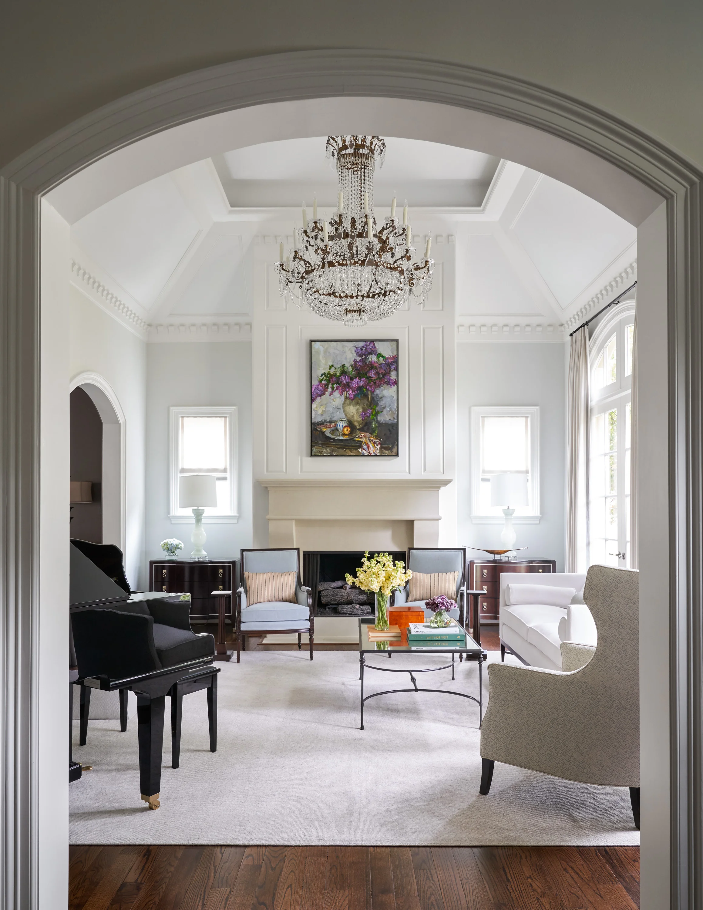
My latest project, a renovation and remodel of an existing home in Houston, is a serene showcase of neutral colors and chic style. While I love color as much as the next person, there’s an elevated sophistication to using a neutral palette. Let’s take a tour!
Beth Lindsey Interior Design, photos by Nathan Schroder
My clients, who are young professionals, wanted a calm and relaxing environment for themselves and their young children. If you can believe it, the home was originally faux finished in golds and Tuscan reds - the exact opposite of the airy and refined look my clients wanted. The tall windows and ceilings, and the gorgeous architectural details, set the tone for the interiors I designed, like in the cultured living room above and below.
Beth Lindsey Interior Design
My clients are wine aficionados, so one of the major changes we made was turning a former study into a custom wine room that you can see in the photo below. My clients love to entertain, so this space gives them a lovely bar area for dinner parties or other social events.
Beth Lindsey Interior Design
As a counterpoint to the medium-toned wood of wine room, I enveloped the powder room in a moody Acanthus grass cloth by Celerie Kemble for Schumacher. I’m also pleased with the ebonized free-standing cabinet we designed for the vanity. It continues the sophisticated feel of a jewel-box of a powder room.
Beth Lindsey Interior Design
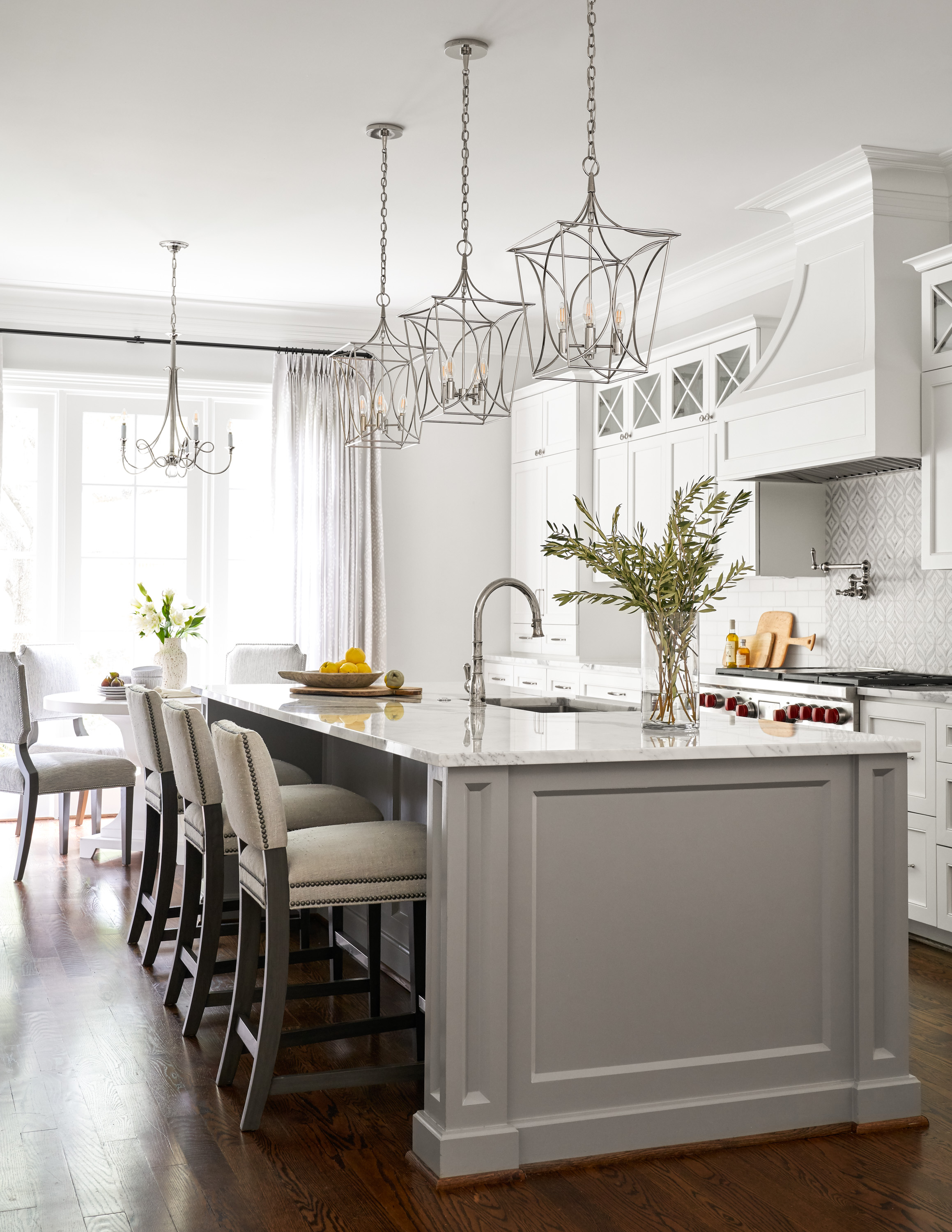
The most drastic change we made to the home was renovating the kitchen and opening it up to a dining area and adjacent family room, as you can see below. The open floor plan is perfect for gathering with the family, and also makes entertaining a breeze. Again, I used a light and airy neutral palette in the kitchen, beginning with a soft marble mosaic from Walker Zanger behind the Wolf range, then painting the cabinets, ceiling, and trim with Sherman-Williams Extra White and the walls a slightly contrasting shade of Benjamin Moore Paper White. The island I painted a soft, medium gray with Benjamin Moore’s Storm, to pick up the gray from the backsplash.
Beth Lindsey Interior Design
The dining area is serene and neutral right down to the art, and I absolutely adore the custom table design I designed for this space. The chandelier from Circa adds a chic touch with its gentle curves.
Beth Lindsey Interior Design
The family room continues the the relaxed, neutral vibe, but I introduced some icy blues to complement the warm deep woods of the the coffee table and bench. The contemporary side chairs and deeply tufted sofas are all custom, and the latter is covered in Kravet’s Everyday Lux in Glacier. It has a stain and soiling resistant treatment so it’s perfect for family use, but is still elegant.
Beth Lindsey Interior Design
Another major overhaul to the existing home was redesigning the master bath into a luxurious spa-like retreat, with dual sinks and custom cabinetry. Again the palette is soothing and neutral, with a hint of blue to the gray cabinets with Benjamin Moore Adagio.
Beth Lindsey Interior Design
A luxurious free-standing tub, dual shower, and a perfectly faded antique carpet complete the space.
Beth Lindsey Interior Design
I hope you enjoyed the tour of my latest project as much as I enjoyed sharing it with you. Not only I am I happy with the results, but the entire remodel was as easy and stress-free as the the clients were! Consider a neutral and sophisticated palette in your next home redo - you won’t be sorry!
Warmly,
Beth


